Set Collector
Role / Services
Research, Design, and Testing
Role / Services
Research, Design, and Testing
Role / Services
Research, Design, and Testing
Year
2024
Year
2024
Year
2024

How do you take a slightly dated desktop database and liven it up for mobile and tablet views? In working with Golgotha Press on their trading card platform Set Collector, I combined effort with 3 other designers to do just that. We assembled on the platform Riipen, which helps small businesses, nonprofits, and start ups find designers to bring their projects to life. Working with founder Scott LaCounte, the team and I created a plan of action for this dynamic conversion.
the process & the problem
the process & the problem
The Problem
Set Collector's trading card database currently lacks optimized mobile and tablet experiences, creating significant barriers to user engagement and limiting the platform's ability to serve collectors when and where they need it most.
Collectors need immediate access to essential card information and collection management tools while making purchasing decisions in real-world scenarios (auction platforms like eBay, card shows, estate sales), but Set Collector's desktop-only experience creates a critical gap between information needs and information availability. More critically, this limits Set Collector's ability to generate affiliate revenue through eBay and other platform partnerships when users are most likely to make purchases.
Business Impact
Lost affiliate revenue for Set Collector - Users can't access purchasing links when they're most motivated to buy
Lost purchase opportunities for users - Users need the ability to quickly access critical card data, and make subsequent purchasing decisions.
As a result, this reduces the platform value proposition compared to mobile-accessible competitors.

discovery
We broke discovery down into 3 areas:
Audit desktop designs for critical process and information
Competitive analysis of similar platforms (feature comparison chart)
Create a persona and story to inform our designs
We broke discovery down into 3 areas:
Audit desktop designs for critical process and information
Competitive analysis of similar platforms (feature comparison chart)
Create a persona and story to inform our designs
Desktop Audit & Usability
Pain points
No clear card/page for each card or set, database somewhat disjointed
No user dashboard for collections at a glance
Poor experience on mobile and desktop views, leading to some information getting cut off or being inaccessible
Priorities for Mobile
User Dashboard
Buy Now - Affiliate links drive revenue
Pricing and availability
Quick view of missing cards in a collection
Non-negotiables
Buy Now
Own vs Need
Price alerts

findings & recommendations
findings & recommendations
There were definitely some hiccups in testing, and opportunities to enhance user guidance, streamline interface elements, and improve clarity in task workflows. These findings will be vital for refining the platform's user experience and addressing the diverse needs and expectations of its potential user base.
There were definitely some hiccups in testing, and opportunities to enhance user guidance, streamline interface elements, and improve clarity in task workflows. These findings will be vital for refining the platform's user experience and addressing the diverse needs and expectations of its potential user base.
Overall Summary of Key Findings:
Navigation and Usability: Participants generally found the navigation straightforward but encountered challenges with specific functionalities like button actions and expected outcomes.
Feedback on Tasks: Clear instructions were appreciated, though some confusion arose around task specifics such as user actions and expected results.
Interface and Design: Comments on interface clarity, use of space, and consistency across tasks highlighted areas for improvement.
Competitive Analysis & The Team
Competitive Analysis & The Team
Normally, this is where I talk about how we spent a decent amount of time up front analyzing other trading card, or trading/cataloging, platforms for competitor solutions (which you can read here). But in delegating that work, there was some miscommunication regarding who would do what. Another designer submitted a write up for the database assigned to me. Not a big deal at all, but it ended up causing issues between two of my teammates. That miscommunication led to a perceived slight between them, followed by a fiery exchange of Slack messages.
This is how my duties "evolved" to more of a background, people management role, making sure that one team mate felt heard instead of dismissed, and the other felt included instead of dogpiled. Soft skills are vital to managing this kind of friction in the workplace. Cooler heads prevailed at this point, and we were able to move forward and focus on the user, actions, and behaviors.
The User
Without much initial research, we had to rely on Scott for some direction while brainstorming. Trading card collection is a past time for all ages, but the average user for a platform like Set Collector is men between 40 and 60. We developed our user, Mike Thompson, mostly based on Scott himself and the information he gave us about his users.
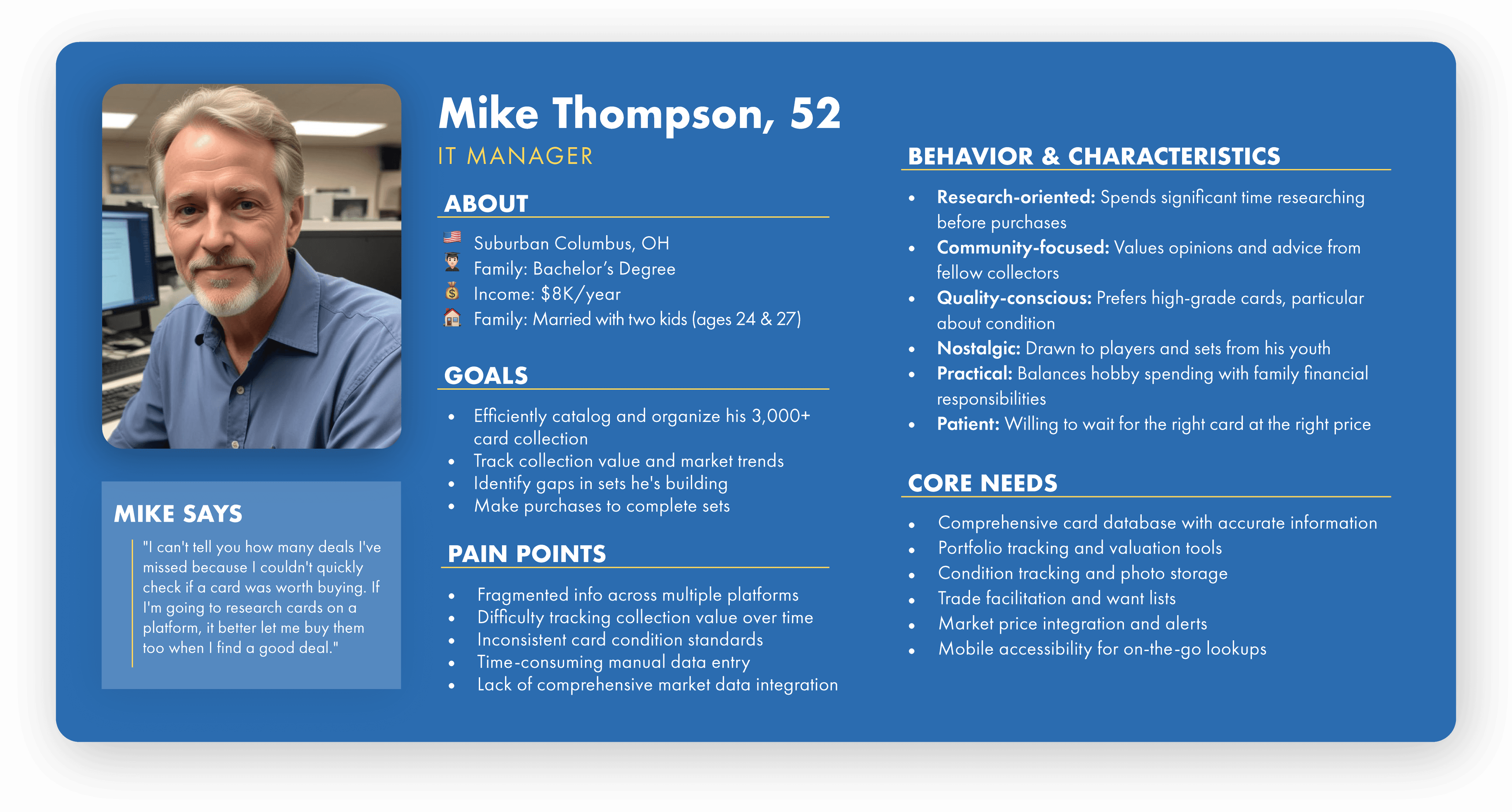
Mike represents a typical serious adult collector who would be a core user of Set Collector's platform. He is someone who has moved beyond casual collecting into a more systematic, investment-minded approach while still sparking that emotional connection that drives the hobby. Some needs the platform should address are comprehensive cataloging, valuation tracking, research tools, and community features.
Mike represents a typical serious adult collector who would be a core user of Set Collector's platform. He is someone who has moved beyond casual collecting into a more systematic, investment-minded approach while still sparking that emotional connection that drives the hobby. Some needs the platform should address are comprehensive cataloging, valuation tracking, research tools, and community features.
mapping & user flows
mapping & user flows

Essential for Purchase Decisions & Revenue Generation:
Card identification and verification (year, set, player, card number)
Current market value and recent sales data
Integrated purchase options with affiliate links (eBay, COMC, other partners)
Card condition/grading information
Ownership status (Do I already own this card?)
Price comparison across affiliate platforms
Primary User Flow
After we felt confident with the context in which we were building, we started working on the main tasks that desktop users would need:
Create a price alert for a needed card
Purchase a card after alert
Primary User Flow
After we felt confident with the context in which we were building, we started working on the main tasks that desktop users would need:
Create a price alert for a needed card
Purchase a card after alert
sketches and objects
sketches and objects
Regrouping with OOUX
When it comes to designing for different formats, it can be helpful to start mobile and work your way up. This is ultimately not how our team handled it. We already had too many cooks, and for the sake of team cohesion, I was left to prototyping and testing rather than design. Not a problem, but when we had our next meeting, the mobile wireframes ended up with BUY (FIND) NOW being the only bulk action a user can take on mobile. This gave me an opportunity to reassert my input by really examining the data and items we are dealing with, and why.
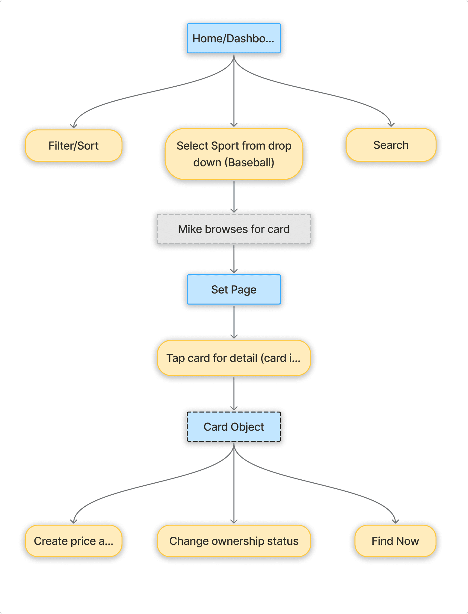
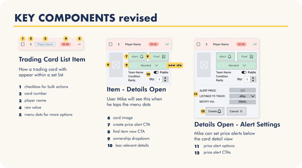
Since the desktop design, and thus the information architecture of searching for a card are pretty set in stone, I focused primarily on interactions with the detail view for a particular card, and in the list view of a card set.
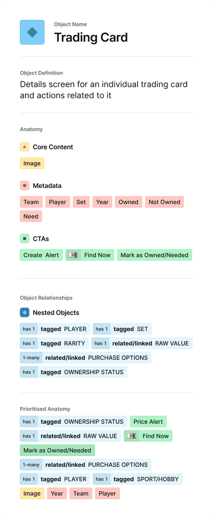
I decided that the OOUX framework might be a helpful process to provide some clarity. The primary interactions between the mobile user and the interface (catalog a card as owned/needed, create a price alert, purchase through affiliate) will occur on the individual trading card screen OR on the Set page screen. Mobile constraints may limit some of the actions the user can take when viewing a card set. Focusing on the individual card as an object, allows me to better lay out the attributes, and actions the user needs to make a decision.
I used an object card template from the Figma community to plot out everything I need to communicate, prioritized them, and laid them out in a way that makes sense. For this user, the primary information to act from is the ownership status of the card, its raw value, and options to purchase via affiliate links.
Regrouping with OOUX
When it comes to designing for different formats, it can be helpful to start mobile and work your way up. This is ultimately not how our team handled it. We already had too many cooks, and for the sake of team cohesion, I was left to prototyping and testing rather than design. Not a problem, but when we had our next meeting, the mobile wireframes ended up with BUY (FIND) NOW being the only bulk action a user can take on mobile. This gave me an opportunity to reassert my input by really examining the data and items we are dealing with, and why.
Since the desktop design, and thus the information architecture of searching for a card are pretty set in stone, I focused primarily on interactions with the detail view for a particular card, and in the list view of a card set.
I decided that the OOUX framework might be a helpful process to provide some clarity. The primary interactions between the mobile user and the interface (catalog a card as owned/needed, create a price alert, purchase through affiliate) will occur on the individual trading card screen OR on the Set page screen. Mobile constraints may limit some of the actions the user can take when viewing a card set. Focusing on the individual card as an object, allows me to better lay out the attributes, and actions the user needs to make a decision.
I used an object card template from the Figma community to plot out everything I need to communicate, prioritized them, and laid them out in a way that makes sense. For this user, the primary information to act from is the ownership status of the card, its raw value, and options to purchase via affiliate links.
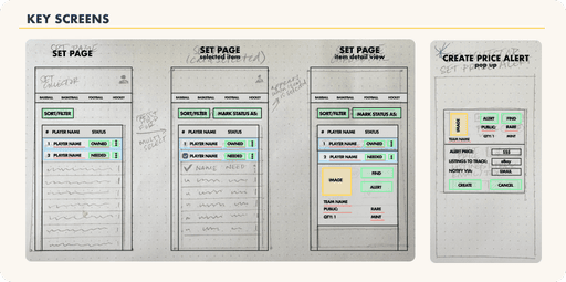
From the object card I created, I was able to sketch some ideas of key screens. I need a set page, a detailed view for a particular card, and a price alert flow from a selected card, keeping status and purchase related actions forward.
From the object card I created, I was able to sketch some ideas of key screens. I need a set page, a detailed view for a particular card, and a price alert flow from a selected card, keeping status and purchase related actions forward.


Using my object breakdown,I tried to prioritize the elements and lay them out. OOUX is admittedly a newer framework to me, and we realized during wireframing that the user has no other option but selecting the appropriate check box and using the bulk actions above the set list. This felt very cumbersome, so I added a drop down to select ownership status within the details component. Leading us to the updated solution below:
Using my object breakdown,I tried to prioritize the elements and lay them out. OOUX is admittedly a newer framework to me, and we realized during wireframing that the user has no other option but selecting the appropriate check box and using the bulk actions above the set list. This felt very cumbersome, so I added a drop down to select ownership status within the details component. Leading us to the updated solution below:
usability testing
usability testing
I prototyped the new screens and ran another round of usability testing. Because we tested the desktop at the start of our project, and I am testing mobile prototype here, this isn't a 1:1 comparison. There were communication snafus between designers and a time crunch. This led to only mobile and tablet screens ready to prototype and test.
Our team member in charge of the tablet screens observed that the user flows for purchase a card and complete a set ended up being practically identical, so we left purchase a card out for tablet testing. The mobile experience had much smoother sailing. I found testers had few questions and generally completed their tasks more quickly.
Test Findings
Test Findings

Brand Design & High Fidelity Prototype
Brand Design & High Fidelity Prototype
As mentioned previously, one of the constraints for our work is the fact that Set Collect's desktop is in development, and we needed to hue close to it visually while designing. One designer took the opportunity to recalibrate and make suggestions for branding and UI design, and fixing some accessibility issues.
As mentioned previously, one of the constraints for our work is the fact that Set Collect's desktop is in development, and we needed to hue close to it visually while designing. One designer took the opportunity to recalibrate and make suggestions for branding and UI design, and fixing some accessibility issues.


Recommendations
Recommendations
There's definitely work to be done here. We're still bumping up against information architecture, so we'll need to come up with something more elegant to improve the user experience for item details.
There's definitely work to be done here. We're still bumping up against information architecture, so we'll need to come up with something more elegant to improve the user experience for item details.
high fidelity solutions
high fidelity solutions
We took our findings, and opted for a reconsiderations of the set page. What does the user need to see at a glance? Should we keep the red NEED background for each list item? Can we try a few different lock ups using icons to truncate content?
We took our findings, and opted for a reconsiderations of the set page. What does the user need to see at a glance? Should we keep the red NEED background for each list item? Can we try a few different lock ups using icons to truncate content?

Iterating from those recommendations, we wrapped our prototype in updated branding and improved accessibility ratings, we continued to streamline the limited space by reducing any redundancies.
Scott was very partial to the icon and background, so in the end, these lockups won the day.
Iterating from those recommendations, we wrapped our prototype in updated branding and improved accessibility ratings, we continued to streamline the limited space by reducing any redundancies.
Scott was very partial to the icon and background, so in the end, these lockups won the day.

looking ahead
looking ahead
The collaborative part of this project did not go as smoothly as I would have liked, but I learned some really valuable lessons in freelance UX work. I've been a creative professional for long enough that I tend to take soft skills for granted. I wish we could've all taken the opportunity to understand each others' processes and working styles. Maybe set some boundaries and establish some house rules. In spite of that, when things went well, they went really well and Scott was happy with our final solutions.
The collaborative part of this project did not go as smoothly as I would have liked, but I learned some really valuable lessons in freelance UX work. I've been a creative professional for long enough that I tend to take soft skills for granted. I wish we could've all taken the opportunity to understand each others' processes and working styles. Maybe set some boundaries and establish some house rules. In spite of that, when things went well, they went really well and Scott was happy with our final solutions.